To display a social sharing pop-up widget that shows on the screen based on user intent, navigate to Social Share > Toolkit and enable Pop-Up by switching on the toggle (shown in the screenshot below).

Once active, click the Settings link that has appeared at the left side of the activation switch button. This will redirect you to the Pop-Up Settings page where you can customize the look and feel of the social sharing buttons!

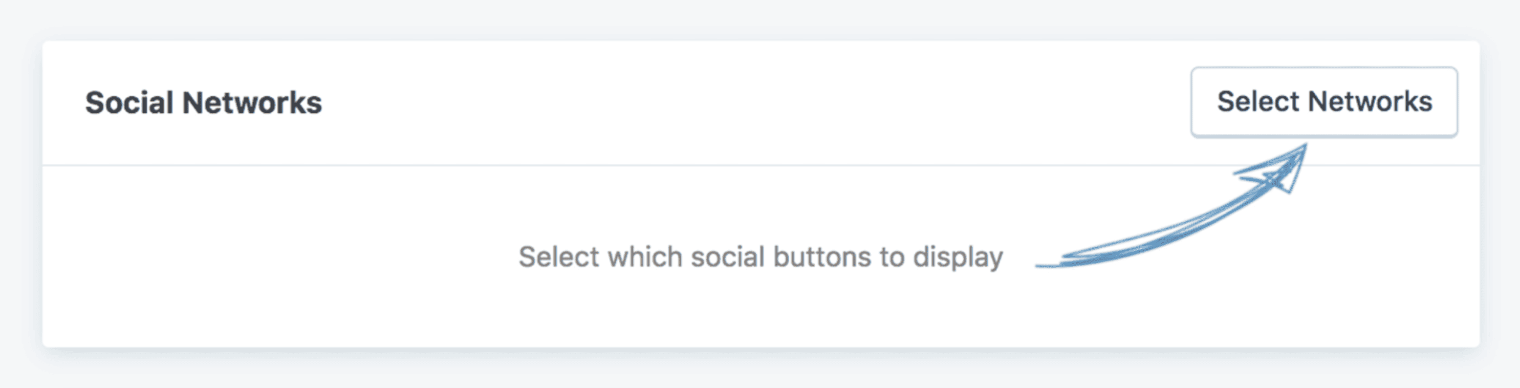
Select Which Networks to Display #
Once in the settings, select which buttons/networks will be displayed to your readers. Click the Select Networks button from the Social Networks section to do this.
Once the button is clicked, a panel with all of Social Share’s available networks will show. Check the social networks you want, then click Apply Selection to complete the process.

Sorting the Buttons #
You can sort the buttons in whichever order you want now that you’ve selected your desired networks.
To sort the items, click and hold the sort icon (the one represented by the three horizontal lines) on the left of each item and move the item to the desired position.

Editing the Button Labels #
You can edit the label for each of the buttons by clicking the Edit Label option for the network you wish to make the change for.
This feature is especially useful if you wish to have a different call to action than the default one. Instead of the default “Twitter,” you may wish to have “Tweet me!”

Selecting a Button Style #
The Pop-Up share tool has eight styles you can choose from. To select one, hover over the option you like and click it.

The styles represented here are just a guideline for how the buttons will be displayed to your readers. The final esthetic depends on the options selected in the next sections.
Configuring the Button Display Settings #

The setting options for this section are explained below:
- Button shape: Modifies the shape of the button to the selected one. You can select between three shapes: rectangular (buttons with right angle corners), rounded (buttons with slightly rounded corners), or circle (buttons with fully rounded edges and no corners).
- Button size: Modifies the size of the buttons. You can select between three sizes: small, medium, or large. Any other button size changes can only be made with custom CSS codes.
- Show icon animation: Animates the social media icon upon hovering.
- Number of columns: This determines the width of the buttons. If you select Auto Width, the buttons will come one after another and have the minimum width they need to display correctly. If any other option is selected, the buttons will be arranged in a grid.
- Show button labels: Enabling will show the editable labels of the buttons.
- Button spacing: Adds bottom and right spacing for each button.
Displaying Social Share Counts #
In the Buttons Share Counts section, you can configure the social share counts options for this sharing tool.
You can choose to display:
- share counts on each individual button as long as the social network represented by the button supports this feature (click here to see what social networks have this option);
- a total share counter that can be placed before or after the buttons, which represents the social shares sum for all active social networks;
- both above options at the same time.

The setting options for this section are explained below:
- Show share count: Display the share counts for a post on each social network.
- Show total share count: Display the sum of a post’s share counts for all social networks.
- Total count position: Enable to display the total share count before the buttons or after the buttons. This option is active only if Show total share count is enabled.
- Share count round: If you have social share counts passing a thousand, the number will be rounded. For example, if the post has a total count of 1234 shares, with this option active, the value displayed will be 1.2k. This option is active only if Show share count or the Show total share count are enabled.
- Minimum global share count: Displays share counts only if the total share count is higher than this value.
- Minimum individual share count: The share counts for a post will be displayed only if they are higher than this minimum share count value.
Button Custom Colors #

- Buttons color: Turns all buttons to the color you have selected. If the Buttons hover color is not set, the buttons will be the social network’s default color.
- Buttons hover color: When hovering over the buttons, they will appear as the color you have selected here.
Pop-Up Display Settings #


- Title: The text here will be the title of the Pop-Up. You can edit or leave blank.
- Message: The text here will be your Pop-Up’s call to action. You can edit or leave blank. You can also add links and images here.

- Intro Animation: Choose your Pop-Up’s animation: No Animation, Scale, Fade In, Slide Up, or Slide Down.
- Show after user scrolls: Enabling will cause the Pop-Up to appear when a reader begins scrolling. When the Pop-Up appears in their scrolling is determined by the Scroll distance (%) setting.
- Scroll distance (%): The percentage of the content the user needs to scroll before the Pop-Up will appear.
- Show when at the bottom of the post: The Pop-Up will appear once the reader reaches the bottom of a post.
- Show on exit intent: The Pop-Up will appear when a reader clicks away from a post.
- Show after “x” seconds: Add a time delay (in seconds) until the Pop-Up should appear.
- Show once every: The Pop-Up will appear to readers once every X number of days (1-7) you select. If you select “Everytime,” the pop-up will appear for each page the reader visits.
- Show on mobile: Enable to show the Pop-Up on small screens.
- Mobile screen width (pixels): For screen widths smaller than this setting, the mobile Pop-Up will display. It will not display on screens larger than this setting.
Post Type Display Settings #

You can place social sharing buttons on single posts, pages, and custom post types that are registered as public. You can select which post types the Sticky Bar will appear on.